skip to main |
skip to sidebar
A few years ago, I met an artisan at the Seattle Gift Show. Her name was Shauna Morrissey and her business was called Two Dog Design, after her...two dogs! I noticed her work because I thought some of it would be perfect in the Columbia Winery retail shop, and I stopped to talk to her. Amazingly enough, she lives and works in the same town as the winery! She was new to the show circuit, young, and enthusiastic as all get out. I knew instantly that she would make a success of her business. Skip to a year later, when she called me asking me to help her design a new booth setup for the San Francisco International Gift Faire. Her deal: She would work as my 'go-fer' at my upcoming SGS seminar in exchange for me sitting down with her and giving her some ideas. How could I pass that up?!!!!So after I worked her to death (really, my seminars are very labor intensive...there was a lot of gathering of products from the show floor and then returning it after I spoke) I plopped down on the floor with her and asked her some questions. Already familiar with her artwork and her aesthetic style, I began sketching on a pad. I was drawing four separate vignettes, each designed to focus on the subjects of each of her four collections of framed & canvas art, furniture, cards, etc. that would form the basis of her booth. We talked as I sketched, and within about fifteen minutes, I handed her the sketches. She looked up at me with a smile...."I could never in a million years have come up with this and you did it in fifteen minutes! THANK YOU!" I just wanna see the final booth and be proud, I said. She sent me images of her booth mock-up that had been photographed by a pro:
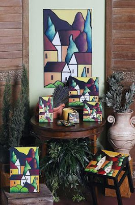
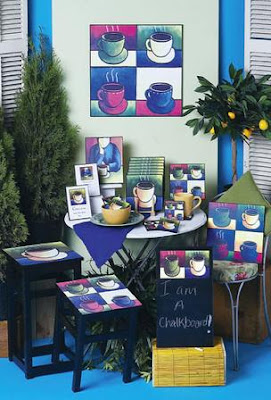
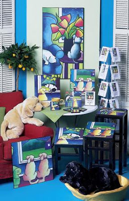

I was thrilled to see the concepts I had sketched come to life, and then when I travelled to San Francisco for my seminars there, I saw the booth in it's entirety:
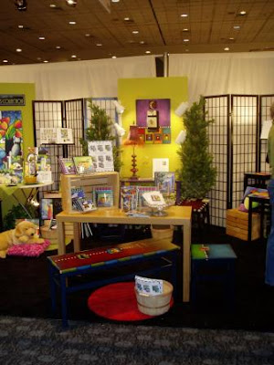 I had no time to talk with her before my seminar, so I came back by to see her late Saturday afternoon. Imagine my shout of glee when I saw THIS:
 Yup, that's an AWARD for 'Best Booth' in the 'At Home' division of the show!!!She was proud, I was beyond myself with joy, and the response she received from buyers was 'The BEST I have ever had!' she told me. Her image was professional, her style upscale, and everyone took her seriously because of the way she presented herself and her artwork. She has since been featured in American Craft magazine, Gifts & Decorative Accessories magazine, and has licensed her designs for production on any number of products. You can find her at www.shaunamorrisseyltd.com. THAT, dear readers, is why visual presentation & merchandising matter.It doesn't take alot of time or money - just paying attention to details.
 It's that time of year in the wine industry - big spring events to launch the release of new vintages. This past weekend was the Taste of Red in the Yakima Valley - I wasn't there for the event itself, but was at Hogue Winery on Friday to begin my part of a redesign project. And I can't even begin to explain the excitement around there for the weekend event - mostly because they pre-sold a slew of tickets, but also because the weather forecast was for SUN! The incredible staff had a great weekend, I am certain.Event decor isn't difficult to do right - just think large. Large scale, large impact, and the fact that there will in all likelyhood be large crowds milling about the space. The photo above is of the entrance to an event at Columbia Winery last spring...the curtained doorway to the banquet rooms makes a huge impact as guests walk up. Large, tall flowers and hot colors are impossible to miss and start the event off on a festive note. The fabric curtains and pipe supports were rented from Grand Rentals, and I did the flowers, which are real branches of plum blossoms and hot pink peonies mixed with silk green viburnum. I want what I want, and if it's not in bloom, I go silk. (No one EVER noticed!)
 Inside the event room, we created a 'photo spot'. In keeping with the theme of a Bacchanalian Celebration, we rented the columns from AA Rentals. I added a bust of Bacchus, a small fountain spewing watered-down wine that sat on top of a wine barrel, several silk grapevines, faux grapes, and some grape lights. Tucked behind was a section of a laurel tree (a very Roman/Greek plant!) that a winery employee donated after chopping it off the huge tree in his year. Decor props come from EVERYWHERE - and free stuff from nature is my favorite to work with.

More columns, and a vase also rented from AA, filled with more blooming plum branches. This adds a nice bit of height and drama to the buffet table. Hot pink peonies and more silk grapevines all add movement and interest. The sheer green tablecloth is actually curtain panels purchased inexpensively at Ross - they have tiny pink roses appliqued all across the fabric. It just whispers 'spring'. Behind it, more pink curtains for impact.
.JPG)
This closeup shows a styro ball covered with Kermit mums and a few pink carnations sprinkled in. These were the centerpiece for each round table (and why I don't have a shot of those, I certainly do not know!) and sat up on a wire frame, which was covered with a silk grapevine. Simple - but effective. Even a crystal vase or bowl with a floating hot pink peony would have done the trick - a splash of color. The important thing at the table is the people, not the decor. (And at winery events, we have to consider that no fragrant flowers or candles are ever used - it interferes with the nose & palate of the wine.)One other note: This event was held on a Sunday evening. The day before was the Wedding Showcase event, where Columbia is open for brides-to-be to view the facilities and see a mini- trade show of vendors who provide rentals and services for weddings. Suzanne, girl wonder, organized that event. SHE ordered the pink curtains, and because the rental company wasn't coming to get them until Monday morning, we were able to 'piggyback' and use them for the wine club event. Saved us MUCHO bucks. SO, if you can ever set up events this way, do it. Half the work (one setup), half the money, twice the impact. Smart budgeting!
.JPG) I wrote recently about one of my fave authors, Alexandra Stoddard , and her new book (her 25th!) titled 'You Are Your Choices'. I highly recommend this contemporary philosopher's perspectives on living beautifully in every facet of your life AND on color. She is fearless with it!
I wrote recently about one of my fave authors, Alexandra Stoddard , and her new book (her 25th!) titled 'You Are Your Choices'. I highly recommend this contemporary philosopher's perspectives on living beautifully in every facet of your life AND on color. She is fearless with it!
Today, I had the pleasure of meeting Sandie and hearing her speak on color. Her seminar at the Northwest Flower & Garden Show in Seattle was held in the very room where I present seminars on retail visual design & display - I will be remembering this day every time I walk into that room in the future! When it was announced that she would be signing books after the seminar, I purchased a copy of 'Time Alive', (which I hadn't known about!), and had her sign it. What a charming, vibrant, animated and inspiring woman...just like her books.
.JPG)
Alexandra (Sandie) and her husband Peter Brown, graciously signing my copy of her book. And how about that COLOR?! Love it. Absolutely. In her presentation, Sandie quoted Maya Angelou: "When things look their darkest, look for the rainbow.
When things REALLY look their darkest, BE the rainbow."
I LOVE that. And this woman really knows how to shine in ANY color!


.JPG)
.JPG)
.JPG)

